
One of the problems with troubleshooting a network problem is that sometimes the answer is right in front of you, but you just can’t see it because of the way you’re looking at the data.
Let me explain…
A Problem Report
I’m going to run through a hypothetical situation based on the scenario described by Patrick over at The Art of Netjitsu. Read it afterwards so you don’t spoil the surprise (if that’s what it is).
Picture the scene: application owners are reporting increased latency on their external connections (e.g. to partner sites via the Internet) during peak hours for the data center. This doesn’t appear to affect a single service, but rather is happening across the board, so the obvious conclusion is that there’s a common cause affecting everything; mostly likely it’s the network, and the common paths for all flows include the core switches, the Internet firewall, and the Internet router, so that’s where we start looking. Since it happens only during peak, it’s also a fair assumption that it’s some kind of capacity issue, right?
Check the Charts
Pulling up the utilization charts on the Core switch for the interfaces facing the firewall doesn’t seem to show us much:
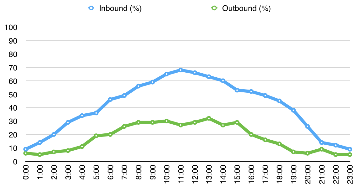
Nothing really obvious here – we’re clearly not at capacity, so the problem doesn’t seem to be throughput. You look at a bunch of other things including sessions counts and still can’t find a smoking gun.
Check the Charts Again
Somebody on the team suggests tweaking the charts and displaying the data as a stacked chart instead of two separate line plots:
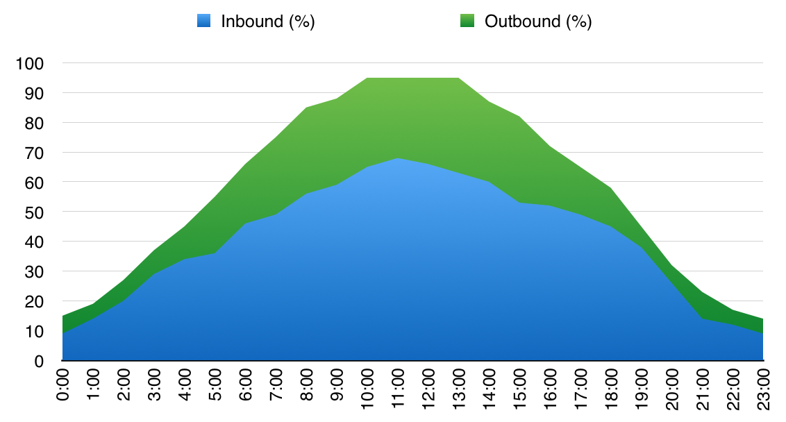 Hmm. That looks a little different – what we’re seeing now is that between around 10AM and 1PM the aggregate throughput seems to plateau around 95%; perhaps “flat-lining” is a better description. In this simulated data – which is only hourly – it’s not quite as obvious as it would be in a real utilization chart where the rest of the data would have more noise in it, so you’d see the chart going from having minor variations to being dead flat during peak hours.
And This Means?
Well, we’re clearly hitting some kind of capacity problem. The chart says 95%, but it’s probably fair to assume that give or take some inefficiencies it would have flatlined at 100%, so we’re looking for something that has, in this case, around a 10G maximum throughput. Want to know what’s going on? Well, take this information and go read Patrick’s Post and it will all make sense!
The point is that sometimes the data is right there in front of you, but it’s not always obvious. Sometimes all it takes is to look at things from a different angle.
Leave a Reply