![]()
This isn’t a typical topic for me, but if you are running a website or blog and you don’t know what apple-touch-icon is, you really need to read on as you’re missing a key part of your website branding.
Safari on Apple’s iOS
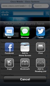
When you view a website in Safari on an Apple iOS device (e.g. iPhone and iPad), buried in the many options to email the link, post it on Facebook and so on, there’s an option to “Add to Home Screen” (dead center):
 The icon that’s offered by default is a tiny image representing the page you’re viewing. In this case, I’m looking at Cisco.com – a company that has a well established web presence, and (unlike so many of us bloggers) has a paid team who look after their web content. And yet, look at that icon. Does it say Cisco to you? Absolutely not. It’s unrecognizable.
The icon that iOS uses in this pop up menu is also the one iOS uses when it creates the shortcut – so it’s the one that people will see every day on their phone. If your site has any kind of branding (no matter how lame… *looks upwards at his own efforts*), you’d surely want that branding to be on a home screen shortcut, right? If you let iOS use the default automatic web page preview images that it creates, your site will be represented by a blurry bunch of shapes and you’d be lucky to be able to distinguish your shortcut from any others on the home screen.
apple-touch-icon
This is where apple-touch-icon.png comes into play. Actually there’s more than just the one file you can use, but the most basic implementation is to put a small PNG file called ‘apple-touch-icon.png‘ in your website’s home directory containing a square logo image. Here’s mine:
![]()
I haven’t done anything special to it; iOS is smart enough to resize it (if needed), round the corners and add the 3D effects that most icons have. Not happy with what iOS did? You can do all the effects yourself, and simply save the file as ‘apple-touch-icon-precomposed.png‘.
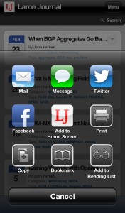
When you add a shortcut to LameJournal to your iOS device, the apple-touch-icon.png is read and used in the pop up menu:
Clever, right? And that’s exactly what it looks like on my home screen too.
Name And Shame
This of course is one more customization that benefits only Apple users (unless Android starts piggy-backing on this icon as well – and it doesn’t as far as I know). On the other hand, there are so many Apple iOS users out there, why wouldn’t you do it?
Have a look around and see which companies have bothered to implement apple-touch-icon on their sites. Some big companies that haven’t:
- Cisco
- Microsoft.com
- Motorola
- HTC
And a few that have:
- Apple
- Samsung
- LG
- Bing.com
- YouTube
Doubly interesting to me is seeing one part of a company implementing it, and another not.
Next Steps
If you want to read more on this topic, GigaOm has a good article on the apple-touch-icon that explains more about different resolution icons, and how to override the icon for individual pages.
Part of the point of icons is to speed recognition of what they represent by offering you a fast visual clue rather then having to read the title. This is such a simple thing to do, if you have any kind of branding in place for your website or blog, you’d be nuts not to spend 5 minutes putting an apple-touch-icon.png file in your home directory and looking so much cuter in iOS as a result.


You should have used your face (the other icon at the top) instead of LJ 😉
Anthony,
I do actually want people to come back…!