Having ensured that you never want to see a ShapeSheet again in Microsoft Visio courtesy of three previous posts here on the subject (1, 2 and 3), I figured I’d touch on Visio again but this time on a slightly more gentle subject – backgrounds. They’re easy to understand, simple to use and yet, inexplicably, only a few people seem use them.
Continue reading (go on, it’ll be easy) to find out how backgrounds can save you time and space while also making your documentation more consistent. Play your cards right and I’ll also compare this approach with using layers – which perhaps I’ll cover another time in more detail.
Note: Screenshots throughout are from Visio 2010; if you have a different version, things may not be quite the same. Also, I’m a network geek, so inevitably I’ll refer to ‘diagrams’ throughout this post, but ultimately the same logic applies whether you’re creating an Org Chart or a Network Diagram.
So first let’s make sure we understand what a background actually is. It’s pretty much what it sounds like – it’s something (anything you can draw in Visio) that sits in the background (kind of like a Windows Desktop Wallpaper) while you draw other stuff on top of it in the foreground. Arguably, if you’re only drawing a single page, it might seem there’s not much benefit to be gained from having your diagram split into a foreground and background, but au contraire, mon frere, there are definitely cases where it is, and we’ll look at them shortly.
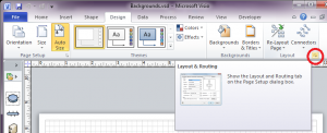
By default, pages you create in Visio are a foreground page. You can see this by checking the Page Setup. You can get to this the hard way by going to the Design Ribbon, finding the Layout group on the right hand end, and clicking the “more stuff” arrow for Layout and Routing, then selecting the Page Setup tab from the dialog that opens (click to zoom):
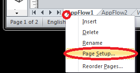
My preferred method is a little easier; right click on the name of the page (the tab name) and choose “Page Setup”:
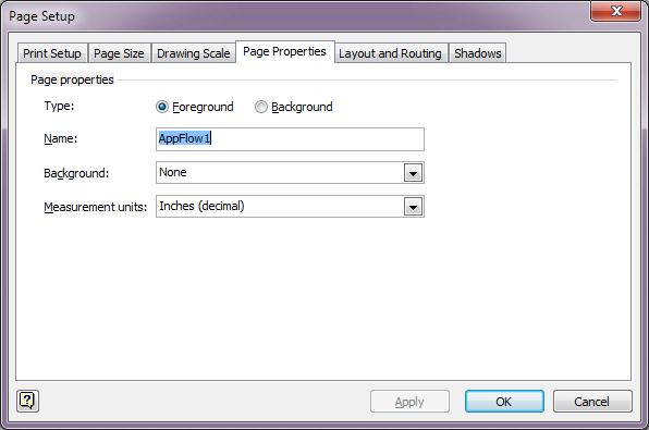
Either way you choose, you’ll end up at the Page Setup dialog:
Top and center is the confirmation we were looking for – this is a Foreground page. You’ll note that you can make a page a background just by selecting the Background radio button; and if you’re paying attention you’ll also spot that there’s a combo box (drop down) under the page name for Background, currently set to None. This is the normal state of things if you create a blank page in a new Visio document.
What happens if I make a page a background? Well, nothing. Almost nothing. The page gets moved to the end of the pages in the Visio, and its name gets italicized:
 All we’ve done it to let Visio know that we might want to use this page as a background to another page. Visio (2010 at least) includes some default backgrounds for you to use. If we return my sample Visio document to have just foreground pages for a moment, the pages will look like this:
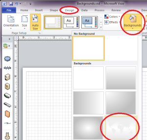
Imagine you want to draw something on a map of the world; Visio handily provides a map for you. Go to the Design tab, choose Backgrounds, and click on the world map:
Your page (AppFlow1 in this case) changes appearance:
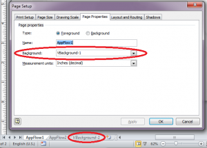
It looks like a world map! But what has really happened? Visio hasn’t added the map to the AppFlow1 page, but rather it has created a new page that’s set as a background in its Page Setup, and has told AppFlow1 (still a foreground page) to use the new page that was created as a background:
As with any other background page, the page Visio creates is at the end of the list of pages and it italicized to demonstrate that it’s a background.
If you click on the AppFlow1 page, you’ll never be able to select the background, and thus never move it or delete it by mistake. That’s part of the beauty of backgrounds – they don’t interfere with the work you’re doing in the background.
Documenting a Data Flow
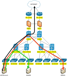
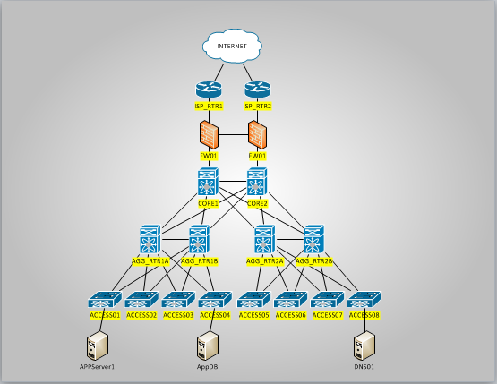
So now, picture the scene – you have a page containing your current network infrastructure and you need to draw some lines and annotations on that diagram showing the path that a particular application’s traffic would take. Here’s the kind of thing I’m talking about here (an ugly example, but it’s just for show):
If you do everything on a single page, it’s common to accidentally select something in the background and move it, or to copy and paste your flow, duplicating one of the underlying routers by mistake. And to select the entire flow and all the annotations – to change line colors or fonts or similar, you have to very carefully select only the items you added to the diagram – nothing so simple as a Select All, as that would also include the infrastructure diagram you’re drawing over. In contrast, imagine now that you take the infrastructure diagram page (“Infrastructure”) and make it a background page. Now create a new foreground page called AppFlow1, and in the Page Setup dialog, configure it to use the Infrastructure page as its background.
You can then draw your arrows, lines and annotations on the AppFlow1 page and it looks exactly like it did when you created everything on a single page, but there’s never a mis-select now; the infrastructure diagram is effectively readonly in the background and stays intact no matter what you do. A “Select All” on a foreground page will never select the background.
Benefit 1: Isolating the foreground and background elements can make working on the foreground much simpler and cleaner.
Documenting Multiple Data Flows
Let’s take this example a step further, and assume that your application has multiple data flows that need to be documented, and you’d like to separate each flow on its own tab for clarity. I think most network folks have at some point been handed a Visio diagram for an application and told to troubleshoot it – only the diagram has about 50 overlapping flows on it and you can’t make head nor tail of it. Worst, I’ll bet half of the network geeks reading this have been responsible for creating one of those unreadable diagrams at some point in their career! In the simple example above, there are three flows on the same diagram and we’re fortunate that none of them intersect, but it doesn’t scale well to continue in the same fashion, so let’s try and separate those into three separate pages.
The normal approach, where a flow is created in the same page as the background infrastructure, would be to create a new tab, copy and paste the entire infrastructure to the new tabe, then create the new flow on top. That’s ok within reason, but can rapidly lead to file size issues due to the duplication of the infrastructure elements on every page. The more complex that background infrastructure, the more rapidly the problem becomes evident. Even with the very simple example infrastructure I’ve used, duplicating the infrastructure on each page led to a 25% larger file, not forgetting that this is a small file and some of the shared size is simply a constant overhead in each file. When I double the number of devices in the infrastructure diagram, using the same six stencils, the file with duplication on each page is now 60% larger.
So rather than duplicate the infrastructure, since it’s identical for every flow we’re drawing it’s an ideal candidate to be created once as a background and simply reference it from any pages that use that infrastructure. So as before, we create the infrastructure diagram as a background page, then this time we will create a foreground page for AppFlow1, AppFlow2 and AppFlow3. Each of these pages is configured to use the Infrastructure page as a background, and a single flow is drawn on each. The infrastructure diagram is stored in the file only once; the infrastructure on which the flows are drawn is identical – it’s not possible to introduce inconsistencies between the pages; and the drawing is positioned exactly the same on all three pages (ideal when you browse or print the flows).
Benefit 2: Backgrounds can significantly reduce file size where the same elements are re-used on multiple pages.
Benefit 3: Backgrounds enforce consistency on all pages referencing them.
The example here is for separating flows, but the concept applies on a wider basis. For example, let’s say you want to document your infrastructure, including the ports used for connections, the vlans trunked, the routing protocols in use, and so forth. You could easily have a single Infrastructure background page and have multiple foreground pages referencing it, with each page containing some of the information. This might also be an application for Layers, or perhaps Layers and Backgrounds – but we’ll look at that a little later.
Multiple Backgrounds
You can have multiple background pages within your Visio file, so if you have multiple data centers that need to be referenced you can have one background for each and reference them as required.
Wherever you identify that there is – or is likely to be – commonality between multiple tabs, there may be an opportunity to consider breaking out those elements as a background.
Let’s be clear here though – these are background elements. When you are on a foreground page and do a “Send to Back” on an object, it will still sit in front of the background. So anything that’s in the background really must be a true background element, as foreground and background elements cannot interact with one another. Of course, it’s always possible to copy elements from the background page and overlay them on the foreground page (in the exact same spot) so that they covers the background version of those elements completely but then allow you to edit and work with those elements. I’ve done this now and then when I need to make a small change on a diagram.
Backgrounds’ Backgrounds
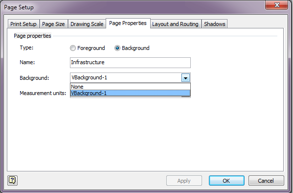
Ok, so this is where things can get a little more twisted. Backgrounds can have backgrounds. This is evident when we look at the Page Setup for a page that’s configured as a background – the Background dropdown is very much active, and lists any other background tabs available in the workbook:
In this case, VBackground-1 is a Visio-generated background called “Center Gradient” that I selected from the backgrounds in the Design ribbon. So I now have a background (Infrastructure) that itself has a center gradient background (VBackground-1). The foreground pages, e.g. AppFlow1 still only reference Infrastructure as their background, but because Infrastructure has its own background, that is inherited in an additive fashion.
Here’s the VBackground-1 background page:
Now here’s the Infrastructure background page, which is configured to use VBackground-1 as a background:
And finally, here is the foreground page AppFlow1, which is configured to use Infrastructure as a background (which in turn has VBackground-1 as its background):
Remember, the only contents on the AppFlow1 page are the colored lines; everything else is in the background.
Instead of a flashy gradient that will print badly, as another use case perhaps consider that your backgrounds could all in turn reference a ‘template’ background that would draw a line around the edge of the page, add the company name, a confidentiality statement and display the document version and the filename / page name? That information would then consistently appear on every page that referenced it; the user wouldn’t have to manually copy and paste that information to every page, nor to update it when there’s a change (ok, there’s a potential use for fields here too).
As a side note, a background of a background can also be configured to have … a background! In this case you wouldn’t see much as the center gradient shown above is an image that covers the whole page. However, backgrounds that are not so all-enveloping can be nested multiple layers down quite happily. There’s probably a necessity to shout out here for common sense – don’t do this for the sake of it. In a similar fashion to database normalization for relational databases, backgrounds are about identifying the common elements and allowing you to reference one copy of that information rather than repeating it and potentially corrupting it along the way. And as with database normalization, it’s possible to go too far. Thank Codd we don’t need to cover that in detail here.
Benefit 4: The ability for backgrounds to have backgrounds allows even common background components to be abstracted to their own backgrounds in – effectively – a hierarchical fashion.
Backgrounds Versus Layers
Layers are a post in themselves (and I’ll probably do just that some time), but effectively the idea of layers is that within a single page, you can choose to tag each element (object) as being a member of one or more ‘layers’. Visio then allows you to control the visibility, printability, and some behavioral aspects of all the objects in a layer at one time via the Layer Properties dialog. For example, I mentioned earlier the idea of a network infrastructure diagram that was trying to track ports, vlans, routing protocols, and so forth. If you think of those things as ‘overlays’ on the underlying diagram, you could put each one in its own layer. Want to see the routing protocols only? No problem – make the RoutingProtocols layer visible and make the other specified layers invisible (e.g. the Ports, VLANTrunking, and IP layers). You could choose to have IP and Routing Protocols visible together; maybe you want port names visible when you view the page in Visio, but not to show up when you print – that’s achievable if you put the port names in their own layer and configure that layer not to Print.
In theory then, each of our data flows could be its own ‘layer’, and to view each flow you just change which layers are visible. And so you can, but I don’t advise it. This is for a few reasons, but mainly because:
- most people don’t really understand how to work with layers;
- there’s no immediate warning to a new viewer that layers are in use and that they are not seeing all the information in the diagram;
- it’s a pain to maintain the layers as you add new elements and update the diagrams – people always forget;
- printing each data flow separately is now a major hassle of changing layer properties, printing, changing layer properties, printing, and so forth;
- as the number of layers increases, it becomes progressively harder to avoid overlap of elements between layers, and thus when you choose to view multiple layers at the same time you often wish you hadn’t bothered.
My experience is that having each data flow on its own page is far preferable, although in this example you would lose the ability to easily merge all flows on a single diagram (which, however, I see as a positive step).
There’s probably a case – depending on your requirements – for using a bit of both approaches. Perhaps abstract the physical infrastructure to a background page, then have multiple foreground pages with limited – and happily co-existing – layers on them with related information. For example, a page with one layer containing the device loopback IP (perhaps used for router-id purposes) and another layer with the routing protocols in it, might be a useful combination; usually both layers would be shown together, but if you ever need to separate the view, it’s possible. Either way, when you use layers, I strongly advise a README page at the start explaining what’s going on and what layers actually exist on which pages.
I Love Backgrounds!
Can you tell? They’re friendly, easy to use, and they can solve a lot of problems. If you think ahead and be sure to only background elements you’re sure are consistent across multiple pages, they are a winner in terms of file space, consistent presentation and data integrity. The only way they could be better, in my opinion, is if you could reference a central server that containe the “One True Copy” of that page, so that you could choose to auto-update the common (background) diagrams any time you chose to, and meanwhile Visio would use the copy locally cached within the .VSD file. Until then, I’ll just keep on thinking up new ways to use what I have.
Happy diagramming!






Thankyou so much for this article! I’ve been looking around everywhere for a clear explanation of what you can do with backgrounds and it’s limitations. Especially useful is the explanation of how Visio backgrounds (from the Backgrounds menu in the ribbon) work – this allowed me to come up with my own solution using backgrounds and templates, thanks again!