As threatened promised we continue our look at Microsoft Visio ShapeSheets, ironically enough, by finding out how much we can do to our object’s textboxes without touching the ShapeSheet. This post is Part 2 of 3, and as a reminder:
In Part 1 I covered some of the underlying terms and concepts required to play with textboxes. I suggest reading this before the other parts, since this is a continuation!
In Part 2 (this post) I’m looking at whether the changes discussed can be implemented without touching a shapesheet in the first place, and look at some of the issues that can arise by doing so.
In Part 3 I’ll look specifically at how to implement these changes consistently via the ShapeSheet.
Let’s dig in!
In Part 1, we looked at moving a textbox around in relation to its parent object, and discovered that it’s possible to have it attached pretty much anywhere you want, so long as you can understand what you are moving. By way of an analogy we pretended that the parent object (a square in our example) is like a noticeboard, and its textbox is like a sheet of paper that gets pinned to the noticeboard. You get to choose not only where to put the thumb tack through the paper, but also where to pin the tack into the board – or, if you like, pinning it into the wall around the board instead. On top of that of course – though not explicitly discussed – you can align the writing on your paper vertically (top, middle, bottom) and horizontally (left, center, right, full), depending in your needs.
What can we do without using a shapesheet? Unfortunately there’s no straight answer, as it depends on the object you are working with. For example, let’s look at what we see when we select the square I was working work in Part 1:
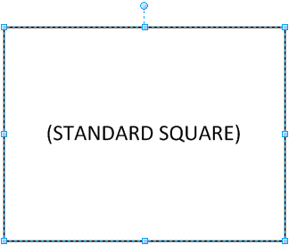
This has the regular handles to resize and rotate the object, but that’s about it. We change the horizontal and vertical alignment of the text one of two ways – firstly using the buttons on the Home Ribbon in the Paragraph group:

Note the arrow on the bottom right of the ribbon group – this opens up a dialog containing more options; this dialog is the second way to set alignment and to set other properties for the text. Either click on the small arrow, or right click on the object and choose Format > Text:
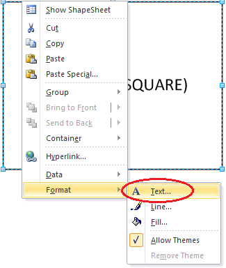
Either approach will open up the text formatting dialog:
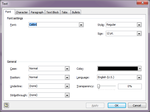
The default tab that opens is Font – not much use to us here, but if you jump to the Paragraph tab, you find the horizontal alignment options, although it is helpfully described simply as “Alignment”:
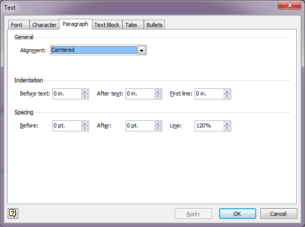
No vertical alignment options here – for that you have to go to the Text Block tab (Microsoft likes to make it easy for you!):
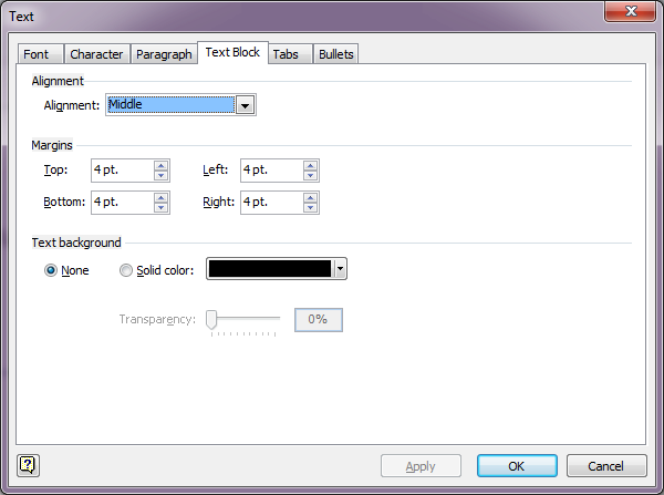
Again, while this represents vertical alignment, it is simply labeled “Alignment” – not helpful when you are searching for the right option. Still, opening this tab has also helped us to find the border options which Visio calls Margins. You will recall from Part 1 that the textbox in a shape has a whitespace border on the inside that keeps text away from the edge. If you don’t want or need one of those border spaces, here’s where you can edit these without going into the shapesheet.
What’s missing from the square object is the ability to move the textbox in relation to the square itself. Let’s take a look at another object then.
This is the standard Server object from the built-in “Network and Peripherals (US Units)” Stencil in Visio 2010 (and earlier):
![]()
Place the icon, and either press F2 or just start typing while the object is selected, and a textbox appears below the object. Let’s try selecting this object and seeing what shows up:
On this object, we have a new control handle – a small yellow diamond hiding in the middle of the text. This is good news, because the yellow diamond allows you to drag the textbox around! The way you are supposed to guess this is that if you position the cursor precisely over the yellow diamond and wait a few seconds, a tool tip appears:
![]()
I don’t usually hang around long enough for that to appear, and I would suspect that the majority of readers are probably in the same boat and have never seen that tip. Still, let’s do what it says, and try dragging the yellow diamond to the right of the server:
![]()
Success! Note that the yellow diamond is centered in the textbox part of the object after it’s moved; from that we can conclude that when the diamond is moved, it’s changing the place that the paper is pinned to the noticeboard, not the position it’s stuck through the paper – in other words, we are affecting TxtPinX and TxtPinY, rather than TxtLocPinX and TxtLocPinY.
Unfortunately there’s a small problem with the way this is accomplished which may or may not be a problem, depending on the icon concerned. The yellow diamond does not directly control TxtPinX and TxtPinY; it’s really a special control that Visio displays to the user whose position relative to the object is stored as part of the control’s properties. In turn, TxtPinX and TxtPinY are told to mirror the position of the control, as we can see if we sneak a peek at the shapesheet (sorry, I can’t help it!):
![]()
The references on the right point back to the X and Y position properties of the yellow diamond control that we dragged around. What are the values of the control? For the server where we dragged the diamond to the right, the shapesheet tells us:
![]()
The default X and Y values for the control when the icon is first placed are (Width*0.5, -TxtHeight*0.5) – that is, centered horizontally, and half the height of the textbox below the bottom of the object.
If you’re of a programming bent looking at the values from the ShapeSheet above, you may be able to see the potential problem now. The control stores absolute X and Y deltas, albeit relative to the object’s width and height. In other words, if I double the height of this object, the control will still be at Height-0.45in, which means that the text will hover a fixed distance below the top of the object:
![]()
This behavior may be desirable in some circumstances (for example, having the text a fixed distance from the right of the object is very helpful), but may be significantly less helpful in others. Without using the shapesheet, you have only one kind of positional control: the one that’s offered to you.
Other controls are as for the square; text formatting and alignment is the same for pretty much every object in Visio.
The shapesheet is really programmatic – by setting values based on other variables (data) about the object, you can adapt your objects dynamically. For example, what happens when I rotate the default server icon (unlikely, but let’s try it for size anyway):
![]()
Pretty smart, right? The text is the right way up, whichever way you rotate the object! Less smart in some ways is how the rotated text ends up being positioned – when the object is sideways, we have some ‘collisions’. I won’t delve into it here, but if you consider the default values for the yellow diamond control, and note that the coordinate system rotates with the object, you can probably figure out why the text is where it is (hint: imagine the piece of paper, and consider where the thumb tacks are being stuck through and pinned). Of course, there’s no good reason to turn a server upside down anyway (is there?), but this kind of smart behavior might be extremely useful on other objects. To tantalize a little further, here’s how the shapesheet accomplishes this magic:
![]()
If that makes your brain hurt, don’t worry about it; what I wanted to demonstrate is that not only can a shapesheet include variables based on object properties, but it can also run functions on the data (again, like Excel). This particular equation is a fancy way or figuring out whether a shape has been flipped before adjusting the angle to keep the text horizontal. If I remember, I will demonstrate what happens when you don’t account for object flipping in Part 3 (or, as is looking increasingly likely, in Part 4 for anybody who is still awake ;-)).
I guess the takeaway I’d leave you with is that you can do simple things using the GUI, but anything more complex probably means using the shapesheet. We looked at two common objects and found limitations with both. Dragging things around is a supremely vague way to manipulate things; that’s why we have things like “Snap to Grid” and suggested alignment to other objects (in later version of Visio). Using a snapesheet to manipulate objects versus dragging controls around is roughly equivalent to the difference between “2+2=4” and “2 + somewhere close to 2 is somewhere roughly around 4-ish I think“. It might not matter if you are only changing a single object, but when you are working with many objects in a Visio workbook, having consistency and predictability makes a huge difference.
YOU CAN WAKE UP AGAIN NOW! 😉
Until Part 3, happy Visio-ing.


Leave a Reply