Shapesheets, eh? Many people I speak to have never heard of shapesheets in Microsoft Visio, let alone used them. That’s a shame as they’re kind of useful to manipulate shapes in Visio and automate the behavior of those shapes. It’s possible to take this to a rather sick level of complexity, but having a basic knowledge of using shapesheets turns out to be rather helpful. So, since I’ve had to explain this a couple of times recently and it would be nice to have something on record, here’s a quick guide to using Visio shapesheets to manipulate the textboxes attached to (most) objects in Visio.
In Part 1 (this post) I’ll cover some of the underlying terms and concepts required to play with textboxes.
In Part 2 I’ll look at whether the changes discussed can be implemented without touching a shapesheet in the first place, and look at some of the issues that can arise by doing so.
In Part 3 I’ll look specifically at how to implement these changes consistently via the ShapeSheet.
First things first: when I talk about a textbox, I’m not really referring to something you add using the A (text) tool. I mean that when you have a shape on the page (either a native shape, a stencil, or a group of objects) you can type text into it, right? For example, I drew a square and while it was still selected, I typed some letters and they appeared in the middle of the square:
Not very exciting I agree, but it’s an interesting property of most objects in Visio that you can type text and it will appear within /on top of / around the object, and that the text is “attached” (i.e. it moves with the object).
TIP: If you want to edit the text within an object, select it and press F2. I’ve been surprised with how many people don’t know this shortcut – it works almost everywhere in Microsoft software – in Windows Explorer to rename a selected file; in Excel to edit a cell; in PowerPoint to edit object text or text blocks; and so on. It’s particularly valuable because when you have objects grouped, you can click until the correct sub-object is highlighted and use F2 to edit just that component’s text, which can otherwise be almost impossible to get into edit mode.
The square above is perhaps not the most exciting demonstration of Visio’s capabilities, but it’s a good starting point – we have text inside a shape. If you’ve ever tried to put a lot of information inside a shape like this, you may have been frustrated about the fact that the text doesn’t go all the way up to the edge of the object; there’s a little buffer zone of white space. Effectively, within the shape’s textbox, there is a slightly smaller usable area in which you can type:
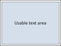
I’ve shaded the usable text area grey to distinguish it from the square it sits within. The white space around it is the border space; we can change borders (down to no border), but for the moment let’s leave them in place and work with the default. Technically the actual textbox within the square object is actually the same height and width as the square it sits within, but with the borders, the usable space is less:
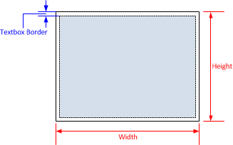
The Width and Height shown here are actually the width and height of the square – they are stored as variables and then used in a formula to define the size of the textbox. This formula is highly complex:
This is our first glance at the ShapeSheet; we’ll look at how to edit it later on, but the similarity to an Excel spreadsheet is uncanny in some respects. TxtWidth and TxtHeight are the object variables that define the size of the textbox within the square, and they in turn refer to the Width and Height of the parent object (the square).
The textbox you will note is handily centered in the middle of the square. This as achieved through the use of two pairs of variables which tend to get confused, so I’ll take a moment to explain them. To do this, we will pretend that the square and its textbox are completely separate entities. Think of the textbox as being a piece of paper, and the square as a noticeboard to which the paper can be attached.
Within the square, we define a point where we want the textbox to be “pinned” This position is defined by the first pair of variables: TxtPinX and TxtPinY, shown below with a red dot:

By adjusting the values for TxtPinX and TxtPinY, the dot moves, and the textbox that’s pinned to that dot moves with it. The size of the textbox does not change as it moves.
TIP: The coordinate origin (0,0) for the values we are discussing is at the bottom left.
Now let’s consider the textbox itself. When it gets pinned to the square (the noticeboard), which part of the textbox (the paper) should the pin go through (so to speak)? There needs to be a way to tell Visio which bit of the textbox to stick the thumbtack through This is accomplished with the second pair of variables, TxtLocPinX and TxtLocPinY, the location of which is represented by a blue dot below:
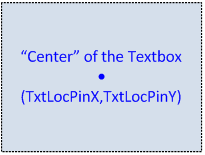
So to place the textbox correctly, Visio aligns the blue dot with the red dot (and what do we get when we add red to blue? Purple of course!):
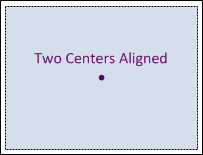
Visio effectively stuck a thumbtack through the center of our paper and then pushed the tack into the center of our noticeboard. (Unusually, we have a noticeboard and a piece of paper that are identically sized!)
It stands to reason that we can mess with this textbox in crazy ways just as you could change how and where you pin paper to a noticeboard, so let’s try. What happens if we change the value of TxtPinX to be equal to Width (i.e. the width of the object)? Our red ‘pin’ moves from its original dead center position (Width*0.5, Height*0.5) to location (Width*1, Height*0.5) – it moves to the right hand edge of the noticeboard. The textbox (which is still configured with its blue pin in the middle) will move over so that the red and blue pins are aligned:

On the left hand side of the diagram above you can see the red pin in its new location, and on the right hand side I have superimposed the textbox as it would be placed. This probably isn’t the most useful place for a textbox; maybe we can move the text all the way outside the square – kind of like a label of sorts? I have two choices here. First, I could try to move the red pin even further to the right (off the noticeboard and on to the wall).
TIP: Unlike a real noticeboard, the red dot that the paper gets pinned to can be moved anywhere within the noticeboard – even on to the wall surrounding it. Do not try this at work, or they may get annoyed with the holes in the drywall.
There’s nothing stopping moving the red dot out further, and so long as the textbox width and the square’s width are the same, it will work reasonably well to change the value of TxtPinX to, say, Width*1.5. Just as easy though, why don’t we move the textbox’s blue pin to be on the left hand edge instead – we’ll pin the paper on its left margin instead of in the center. That way, the left hand side of the textbox will be pinned to the right hand edge of the square, thus positioning the text outside the square to the right. The blue pin is moved from its default (TxtWidth*0.5,TxtHeight*0.5) to (0,TxtHeight*0.5):
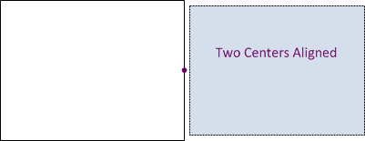
Note that the textbox doesn’t appear to be touching the square. Why is this? Because of the textbox’s border. When we set the blue pin to be at X position 0, we are aligning it with the true left edge of the textbox, not the inner edge of the border:
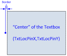
The blue pin shown above is on the true outer edge of the textbox – and that’s what sits over the red pin on the square.
So what use is all this? Well firstly, if you are using lots of RETURNs to position text in Visio, chances are you will find life better if you move the textbox around instead. I draw a lot of network diagrams, and one of the things that drives me most crazy is when an object doesn’t have an attached label, but rather it has a textbox added indepedently, and then the two objects are grouped together to make it easier to maintain. This actually makes it harder to maintain, because to edit the label I would have to click the grouped object, then click the label within it to select it, then press F2 to edit it. I’ve seen too many people struggle editing grouped objects to say that it’s a preferred choice.
TIP: When you group objects together, Visio creates a new ‘object’ that represents the group. This new group object has the same properties as every other object – including a textbox! If you click on a grouped object and press F2, you are adding text to the grouped object, not editing the textbox of a shape within the group. Sometimes that’s a desirable behavior, but more often than not, it’s a pain.
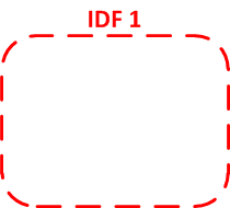
Here’s an example of manipulating a shape’s textbox that I have used in the past to identify sites or groups of devices on a network diagram. Imagine this shape filled with various networking objects as part of a network diagram:
The lazy way would be to create the shape, add a text block above it, and group the two together. It’s not very nice to work with though, and with my shape, no matter how I resize it the label stays centered snugly on top. Additionally, if I have more than one line of text, as I add it, the text moves up to make room for it rather than moving lines down over the square itself:

If you are new to moving textboxes around it may be worth taking a moment to see if you can reverse engineer the process to create this shape-with-text. When you’re ready, here’s the solution.
First, I created a square, set the line width and color and chose a curve to round the corners. The square’s textbox is in its default position, dead center of the shape:

Next, I’m going to change the vertical alignment of the text within the textbox to Bottom – you can do this in the shapesheet, or more simply by clicking the appropriate button on the toolbar:

Here’s the result:
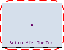
Next, I’m going to change the textbox’s (blue) pin to be at the bottom of the textbox. When it aligns over the square’s centered (red) pin, the textbox will be half way up now:
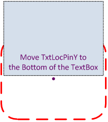
I still need the textbox to move up so it’s above the square – we’ll do this by moving the square’s (red) pin up to the top of the square:
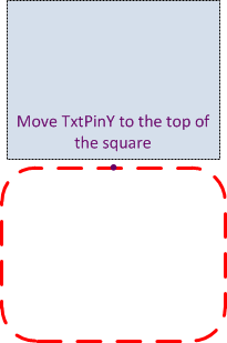
And we’re done – a few very simple steps, and now I have a nice object I can use in my diagrams, and best of all, it’s not a square and a textbox grouped together!
Next time you need to have text attached to an object in Visio, think about whether these kind of changes could help you? Look for the Part 2 and 3 where we’ll dig into more detail and explain how to make the changes demonstrated above.
If anything’s unclear or incorrect, please comment and I’ll try my best to clarify.
–Edited April 24, 2011 @ 3:20pm to correct TxtLocX/Y to TxtPinX/Y and correct the Origin TIP to “Bottom Left” (late night, that’s my excuse).


Leave a Reply